
BKID Co is the brainchild of BongKyu Song, an award-winning Korean Designer. It’s also one of the only design studios that boasts of having a design language unique to it. You can look at a BKID product and there’s something innately BKID-ish about it. Their human-centered, design-based approach is evident in the work that they do, and each product has a playful quality to it, projecting technology as more docile, rather than trying to look superior. The result is a product that looks inviting to people of all ages, and that looks friendly and ready-to-help, rather than cutting-edge and intimidating.
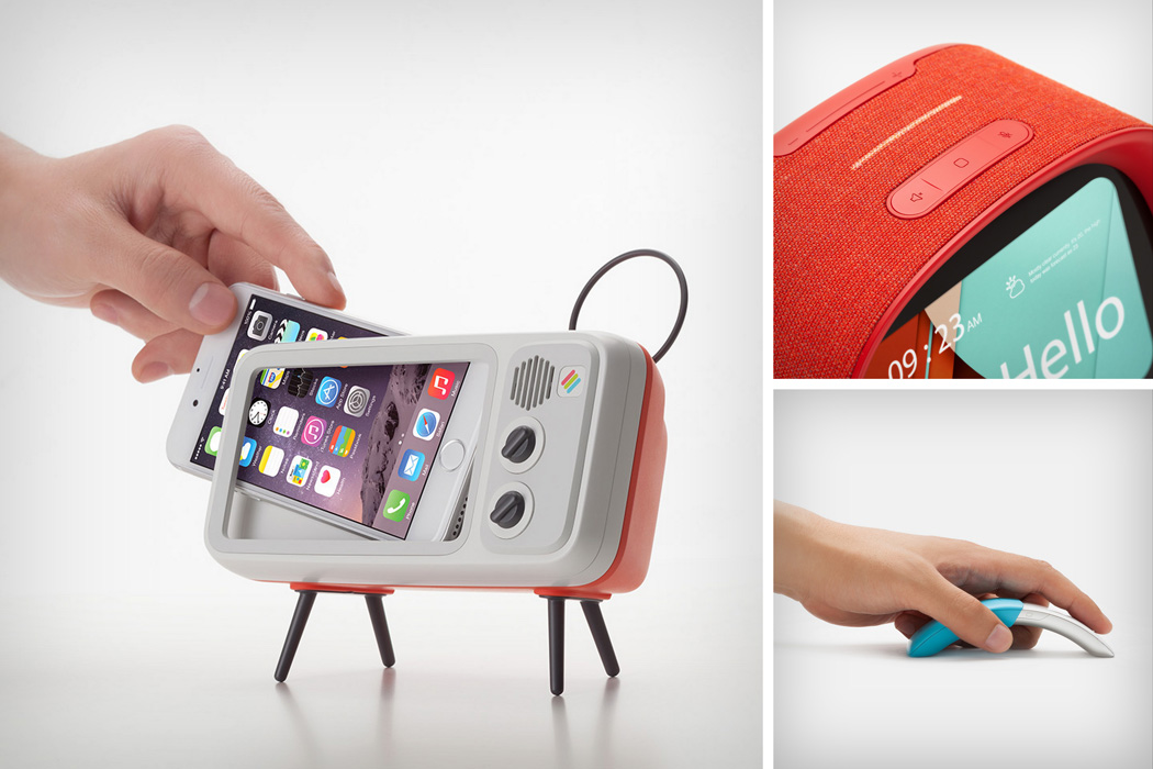
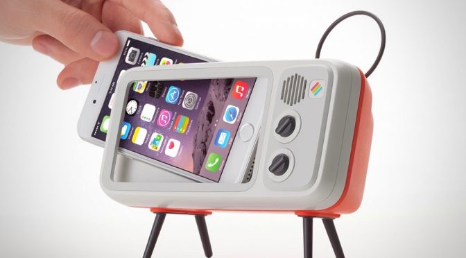
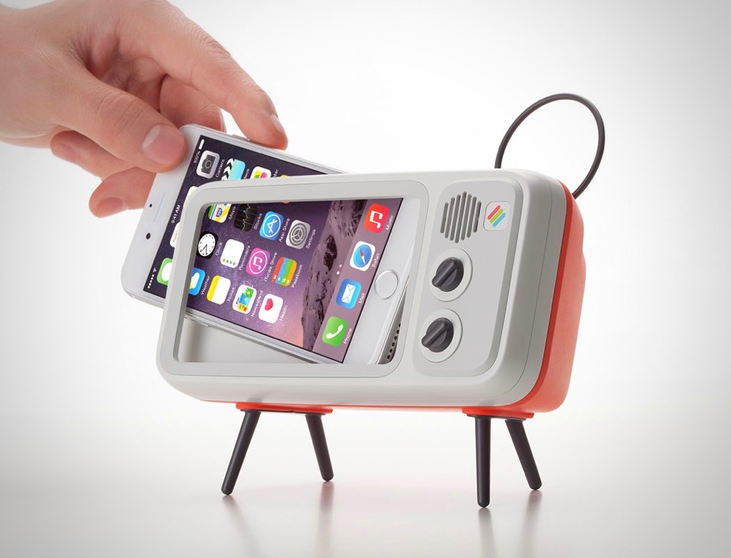
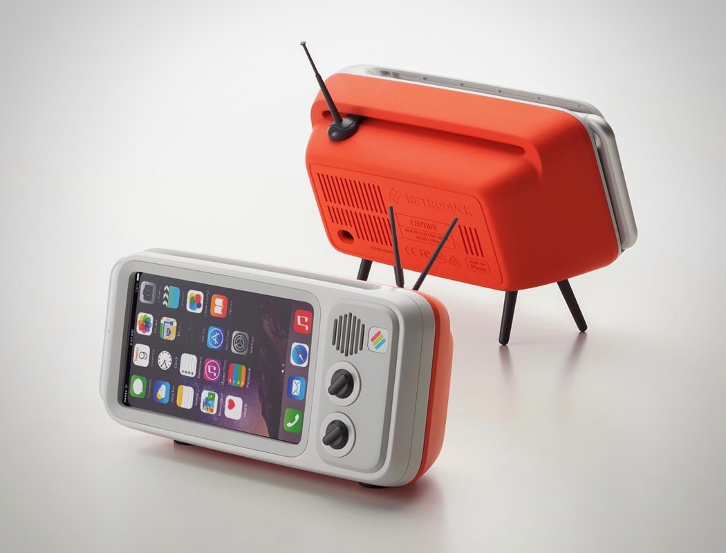
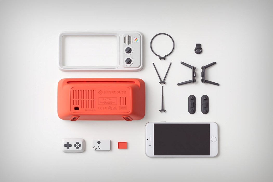
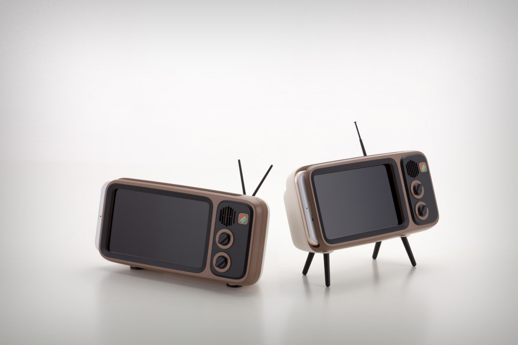
The Retroduck by BKID for Wisekids is probably one of our favorite projects. It pays tribute to one of the earliest forms of entertainment, the Cathode Ray Tube Television. An iconic appliance found in almost every home in and around the 60-70s, the TV set looked bulky but beautiful, and who can forget those knobs for adjusting the channel and volume on the side?! Retroduck harnessed that nostalgia with its ability to dock the iPhone into its housing in a manner that turned the retina screen into a retro appliance. BKID’s design of the Retroduck employed a beautiful color palette of red and white, while also keeping things original with the brown and black combo. Soft curves dominated the design, and its plastic build gave it a more inviting appearance than the usual metallic, cold demeanor of the iPhone.
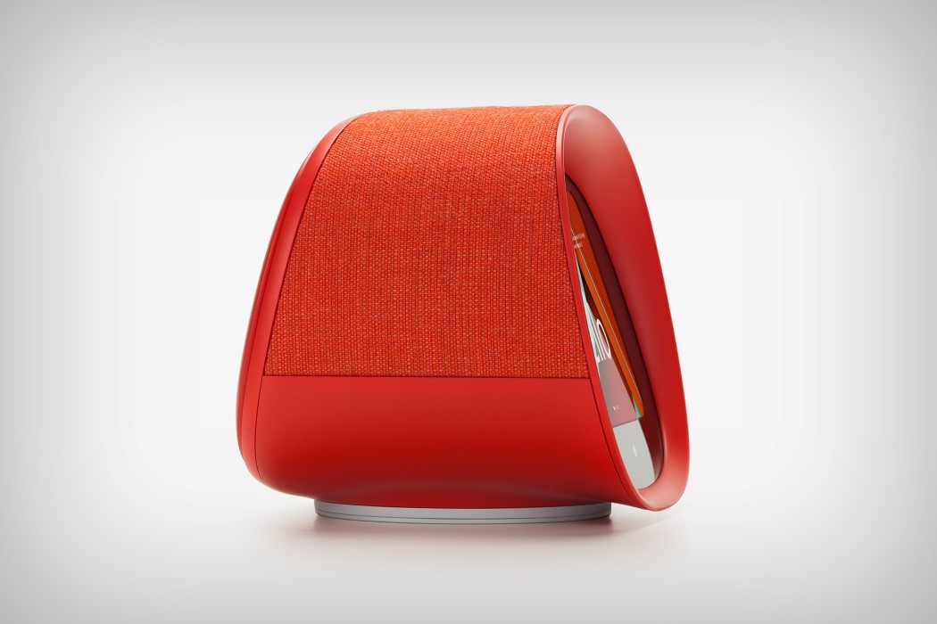
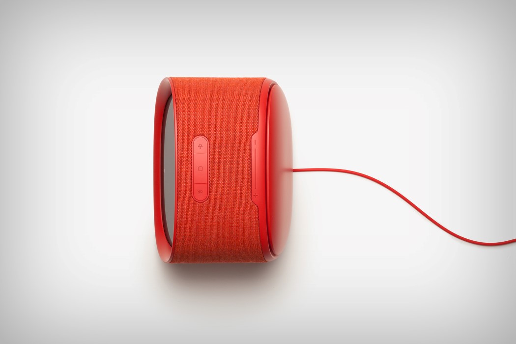
The Fairy for SK Telecom probably most clearly outlines BKID’s approach to product design and how different it is from the others. Pit the Fairy against the Google Home, or the Amazon Echo Show, or even Apple’s Home Pod and you’ll realize that the Fairy was designed with a character, while the others just played along to the character the AI had assumed. What’s more, the Fairy, with its soft, red, almost plush-like design, looks much more approachable than its competitors, even though it’s just as advanced. Think of it as Wall-e and Eva’s love-child in 2017.
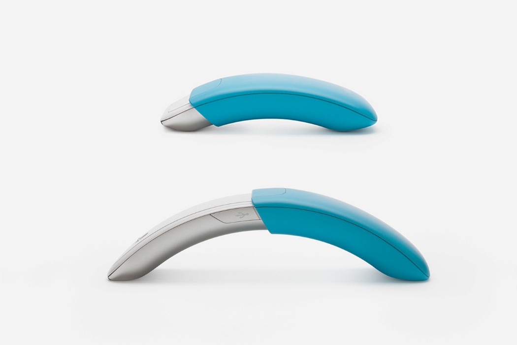
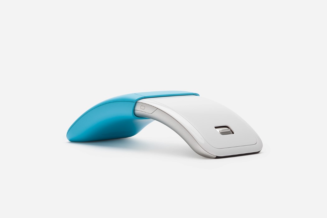
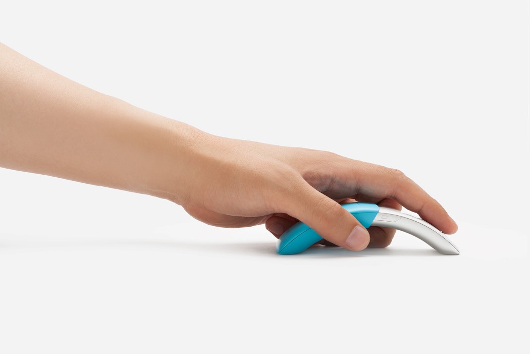
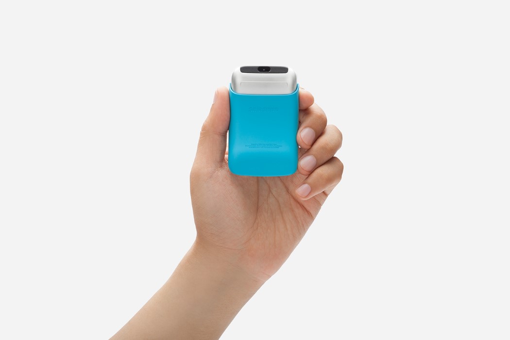
The Samsung Mouse brings design thinking to something that’s essentially an accessory, and therefore, an afterthought. Mice are usually taken for granted until the minute you realize you don’t have one, or that the one you have isn’t working. BKIDs mouse design for Samsung brings a refreshingly different dynamic to mouse design, pointing out a pain-point that most people have with mice (they’re too bulky), and proposing a solution that is full of dynamism and playfulness, but at the same time doesn’t take away from the fact that the mouse is more than capable of being highly useful when needed. The mouse’s telescopic design feels like it would be the primary reason I’d buy it! The silver and blue color duo go together beautifully, and the arc the mouse forms when opened completely feels solid in one’s hand, allowing it to have mass when needed, and turn into a tiny, pocketable device when folded inwards.
 BKID’s products never isolate the user. In fact they play well to human’s ability to trust and adore things that look ‘cute’ and ‘friendly’. BongKyu Song does a marvelous job of using soft curves, rounded forms, and a vibrant, almost childish, color palette to make products look friendly as they solve problems, allowing humans to bond emotionally with them, and therefore always leaving the users with a smile on their faces… and ultimately, isn’t that what we all want??